Marra Forni
OVERVIEW
Marra Forni is a brick oven company that sells to both businesses and consumers. As the in-house graphic designer/marketing specialist, I was tasked with designing graphic material and worked with the marketing team to establish consistent brand identity.
Tradeshow Materials
ROLES
Concept, Design, Production
TOOLS USED
Illustrator, Indesign, Photoshop
COLLABORATORS
Director of Marketing, Marketing Team
THE CHALLENGE
The company was in need of effective branding for our participation at tradeshows that would need to reflect our identity while also ensuring that all branding elements were consistent with each other. Additionally, the booth design needed to be engaging enough attract visitors and efficiently educate them about the company and its products.
THE SOLUTION
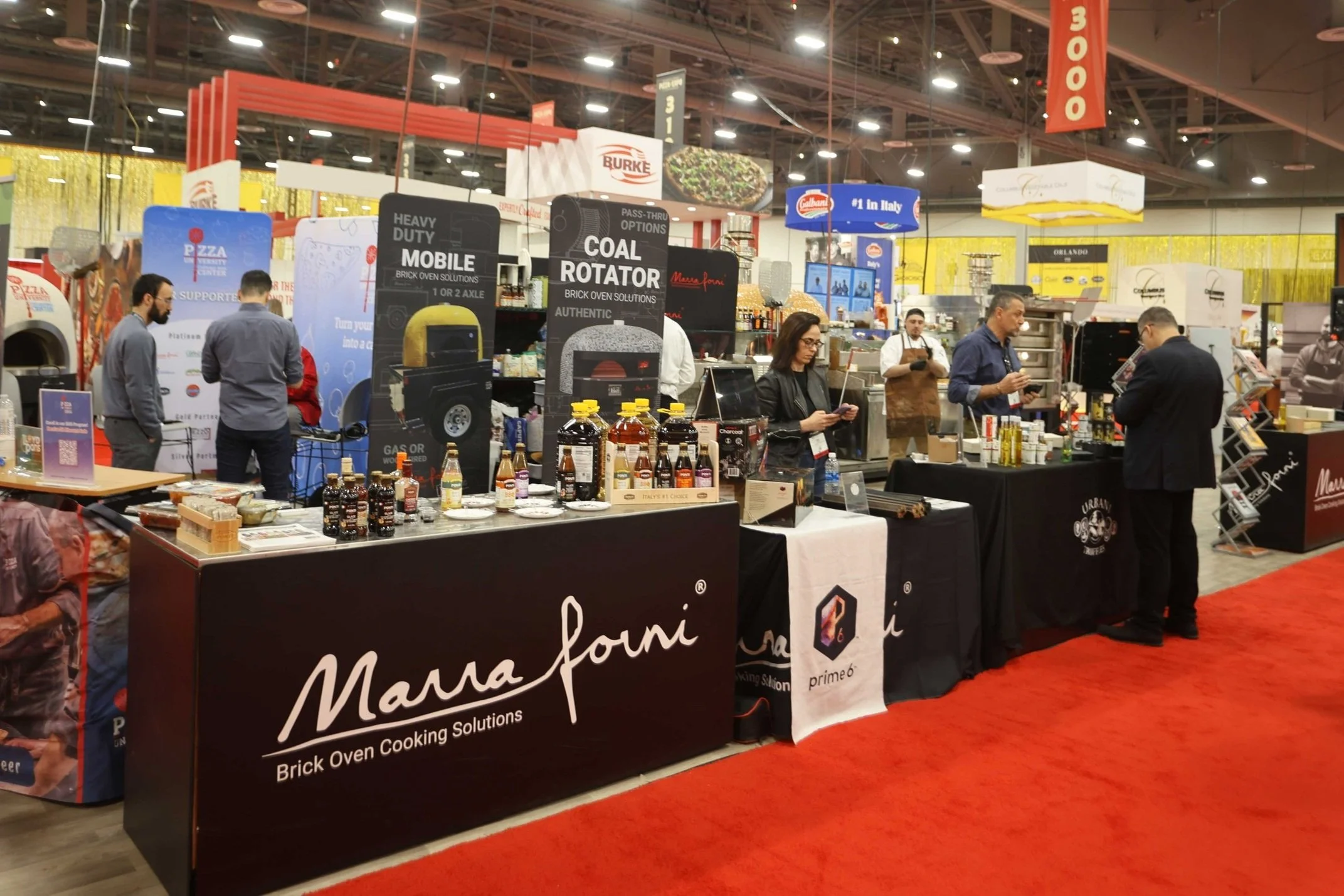
I created a cohesive set of tradeshow booth materials, including standing banners and tabletop banners, that aligned with the company's visual identity. While integrating a consistent visual theme across all elements and adhering to brand guidelines, I ensured that the company’s presence at tradeshows was impactful and highlighted the key elements of the brand and its products.

Tall Standing Banners
I was tasked with designing tradeshow banners to showcase our brand’s most popular products.
Since only the top part of the banner can be seen from far away, the most important elements were prioritized to the top half of the banner. To attract tradeshow attendees, I included a large eye-catching photo of each oven so that people could get a clear sense of what the brand is selling. The idea was to get people to visit the booth using beautiful product pictures, and they would be able to read the contact info up-close or through the other tradeshow materials in the booth.
In the project, I was to incorporate key terms into the banners. To maximize space for other graphical elements, I made this text a part of the faded background, along with the outlined oven graphics.

Retractable Tabletop Banners
Another task I was met with was to create smaller versions of the larger banners to place on the booth tables. This would be used for minor shows, where the team would not be bringing all of the heavy large banners and would need smaller material in replacement.
Since all the elements would have to shrink, I had to narrow down on the ones that were most important. Brainstorming with the marketing team, we agreed to remove less critical graphics/text, which would only make the small space look more cluttered, and add a QR code instead. As people will be up-close when seeing these banners, it would be easy and convenient to scan.

Product Brochures
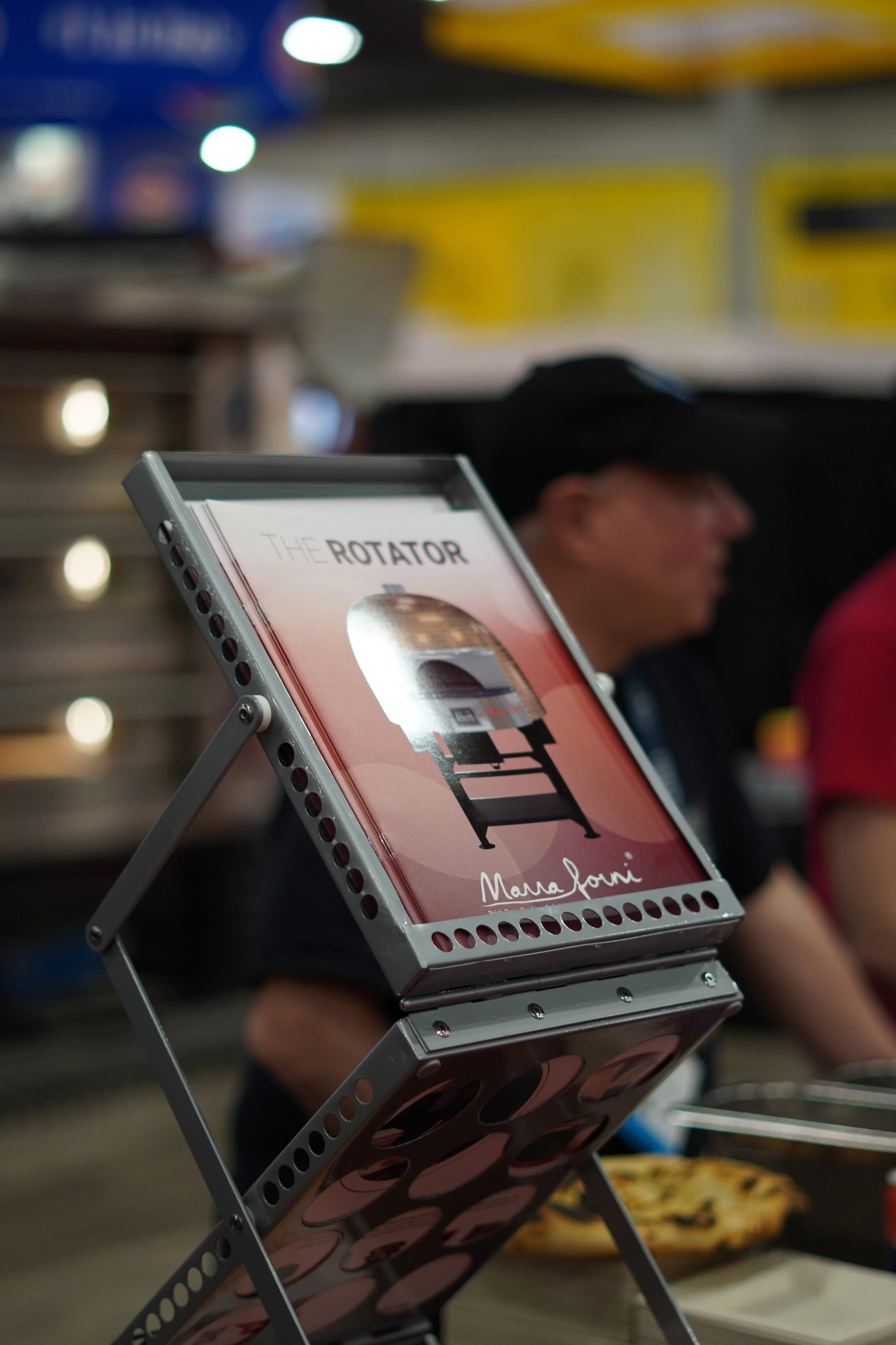
The company wanted to create informative literature that could be easily handed out at tradeshows and other events. These booklets would each highlight a type of product from our catalog (ie. rotating deck oven, electric oven, dough mixers, etc). The general idea was that a customer would be able to pick a product they were interested in, flip through the pages and get the information they needed to get excited about the brand and want to consider purchasing.
I worked closely with my marketing director, team, and other sales representatives to research and put together a collection of informative pages with glamourous product pictures that would sell and market well with our target audience.
Materials In-Use at Tradeshows
One Sheets/Flyers
ROLES
Concept, Design, Print
TOOLS USED
Illustrator, Indesign, Photoshop
COLLABORATORS
Director of Marketing
THE CHALLENGE
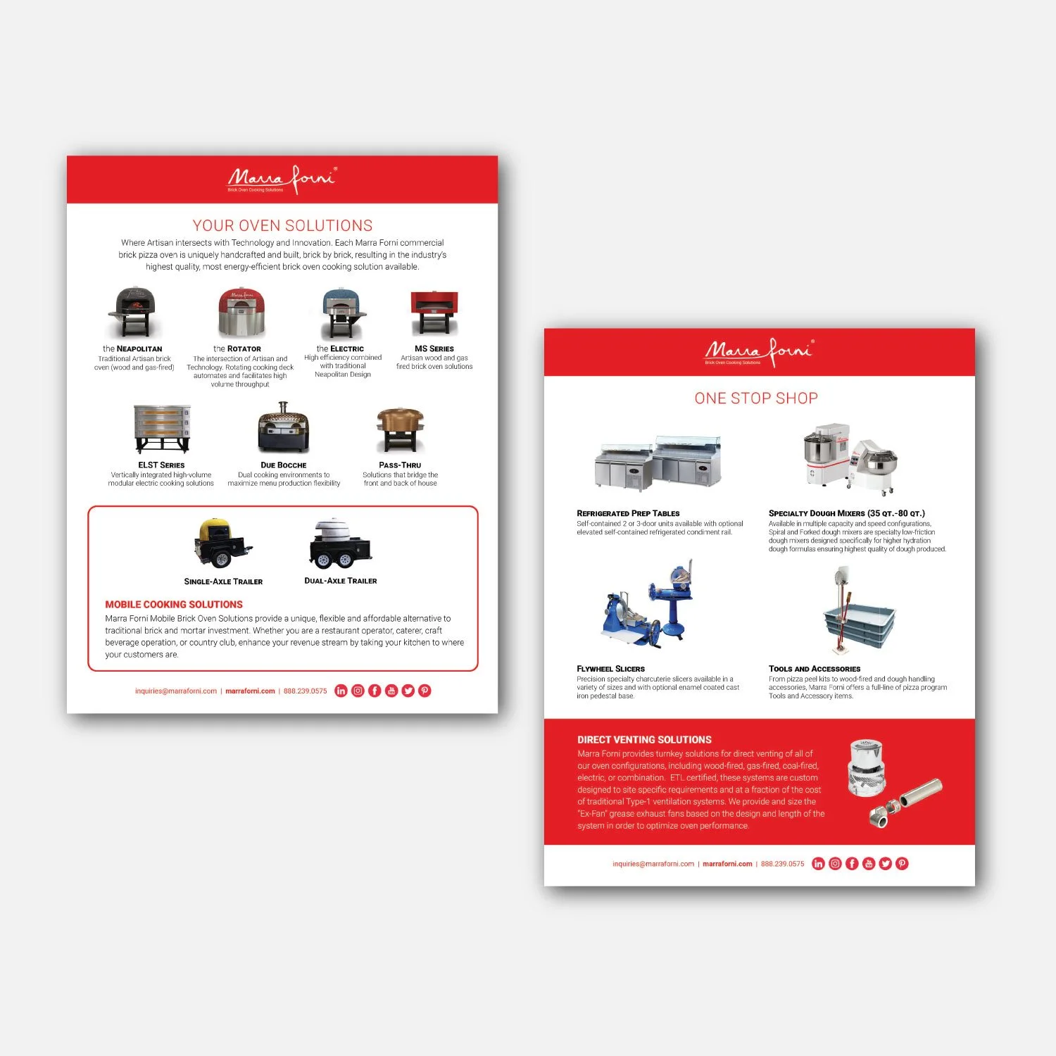
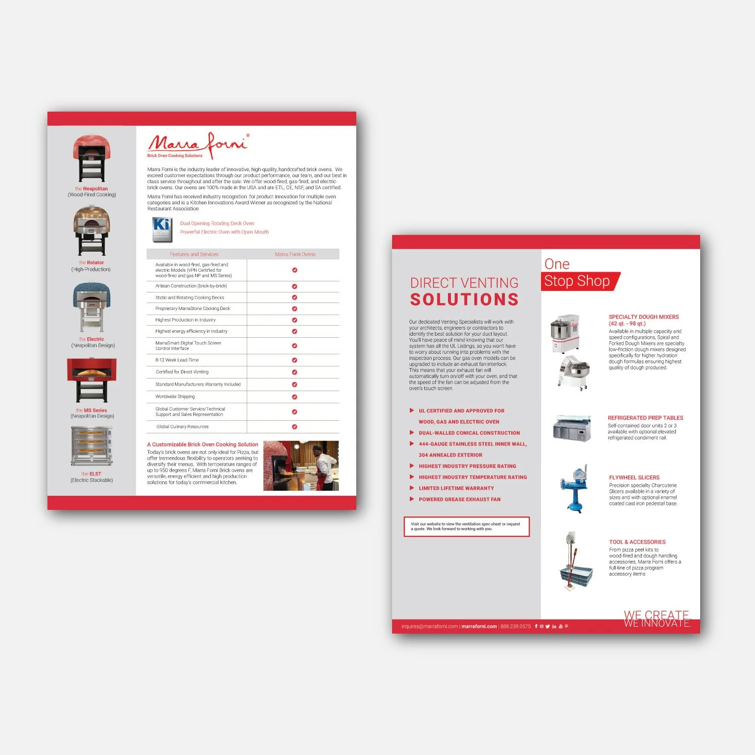
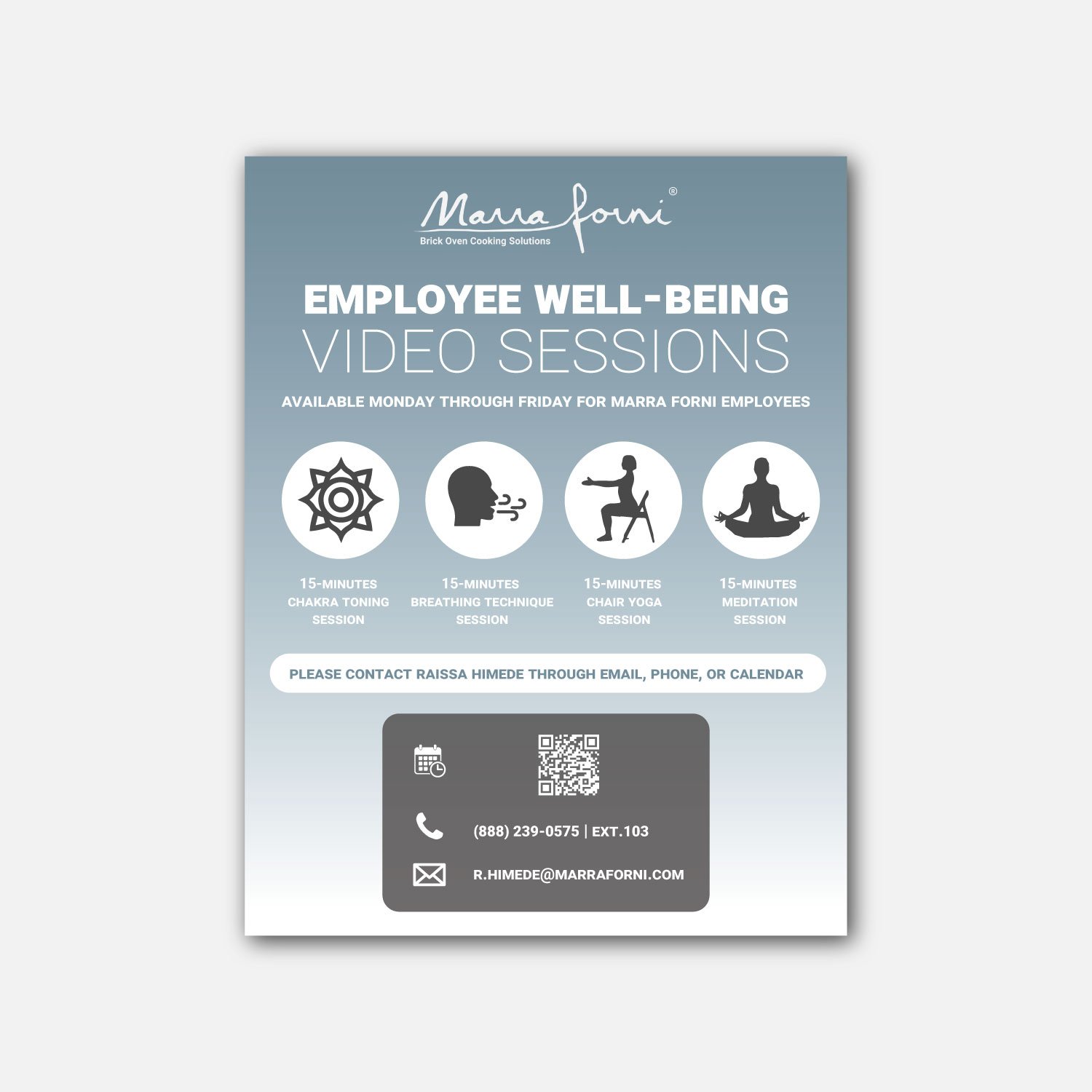
The company often asked for marketing materials that would fit into a compact one or double-sided sheet/flyer. While the materials needed to each be unique and captivated, they must all fall under the company’s current branding guidelines.
THE SOLUTION
I laid out all the information given for the requested flyer and arranged them into a format that would work well with each other, making sure not to stray too far from general branding colors and guidelines. Different marketing materials fell under different categories targeting various moods (ie. professional or relaxed), and I would handle each accordingly. I compromised with team members to shorten or reword certain pieces of text that I believed would help the overall design and readability without losing too much valuable information.
Digital/Print Ads
ROLES
Concept, Design, Revision
TOOLS USED
Illustrator, Photoshop
COLLABORATORS
Director of Marketing, Marketing Team
THE CHALLENGE
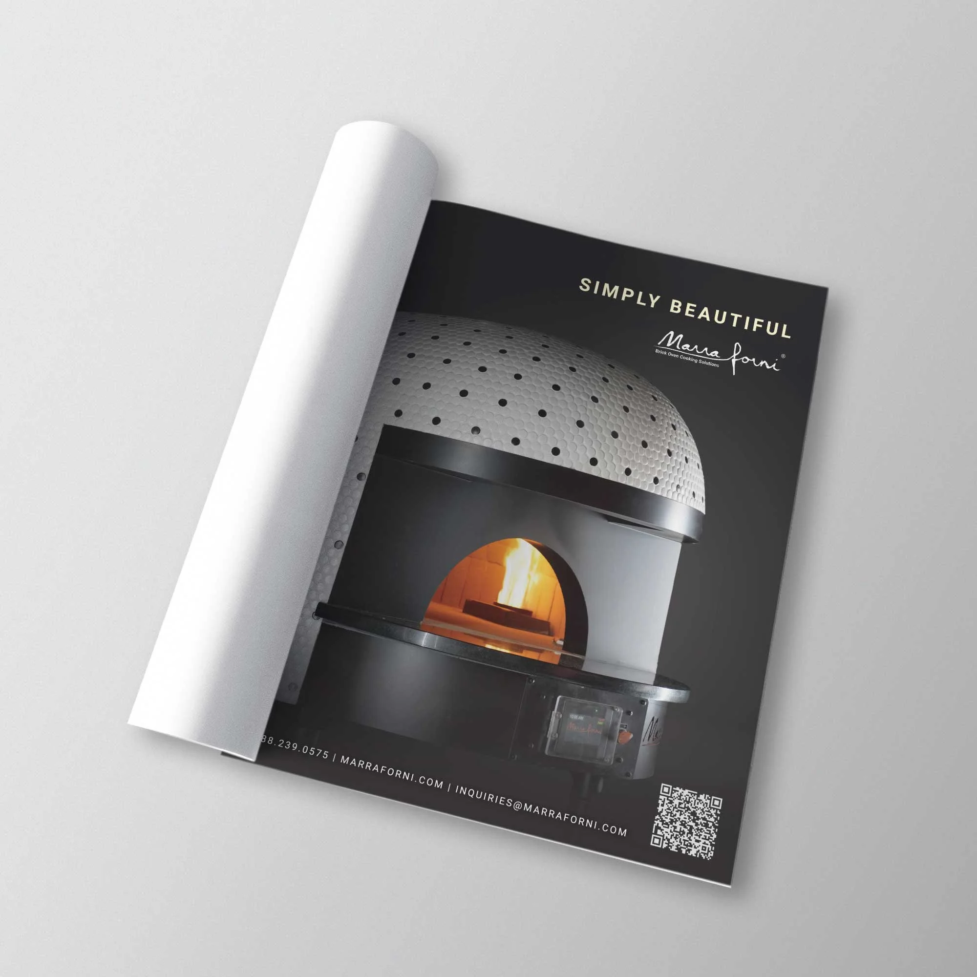
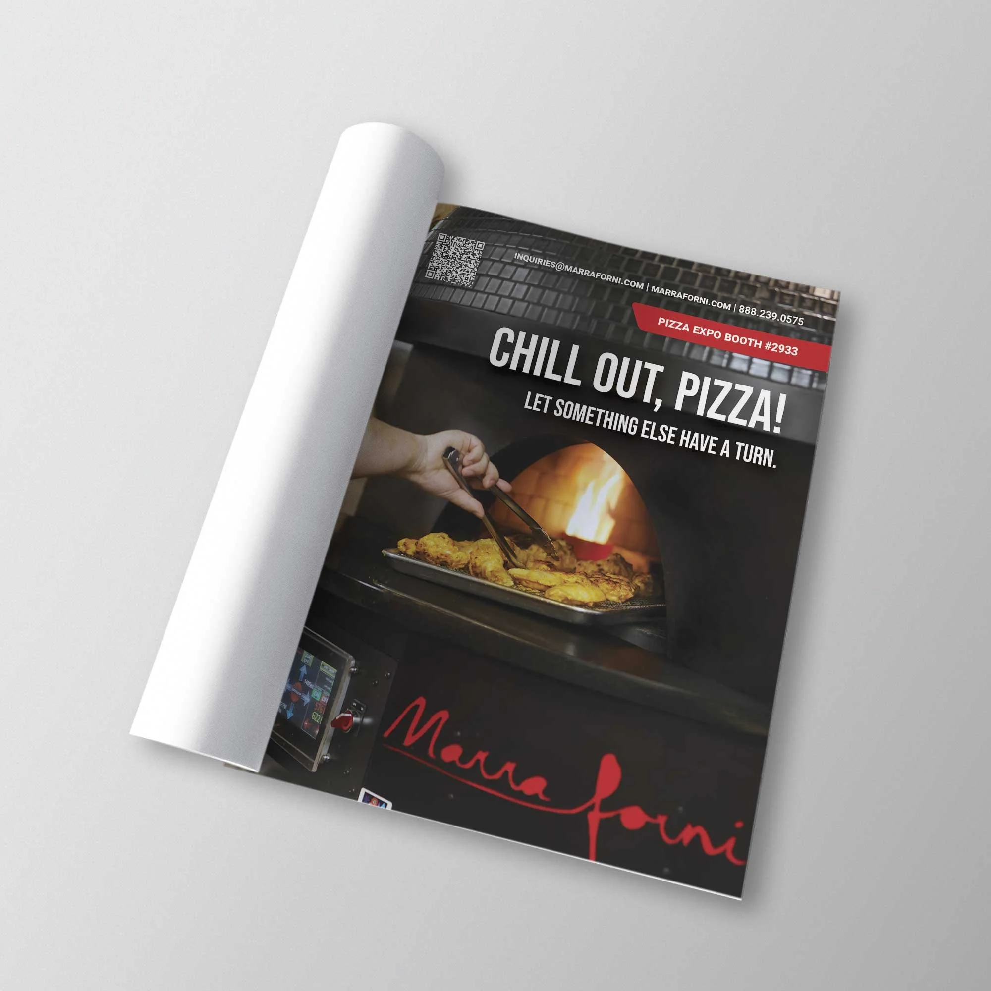
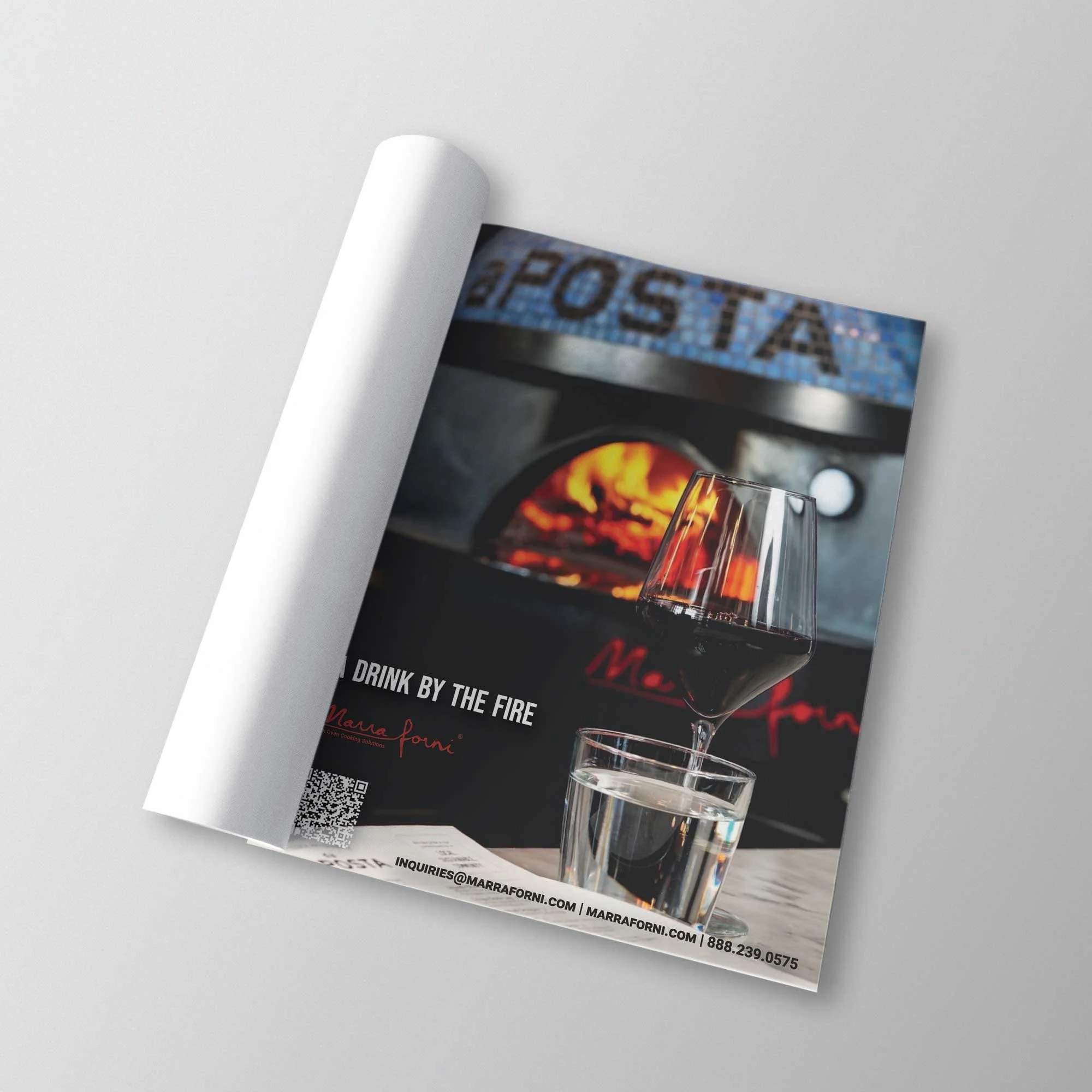
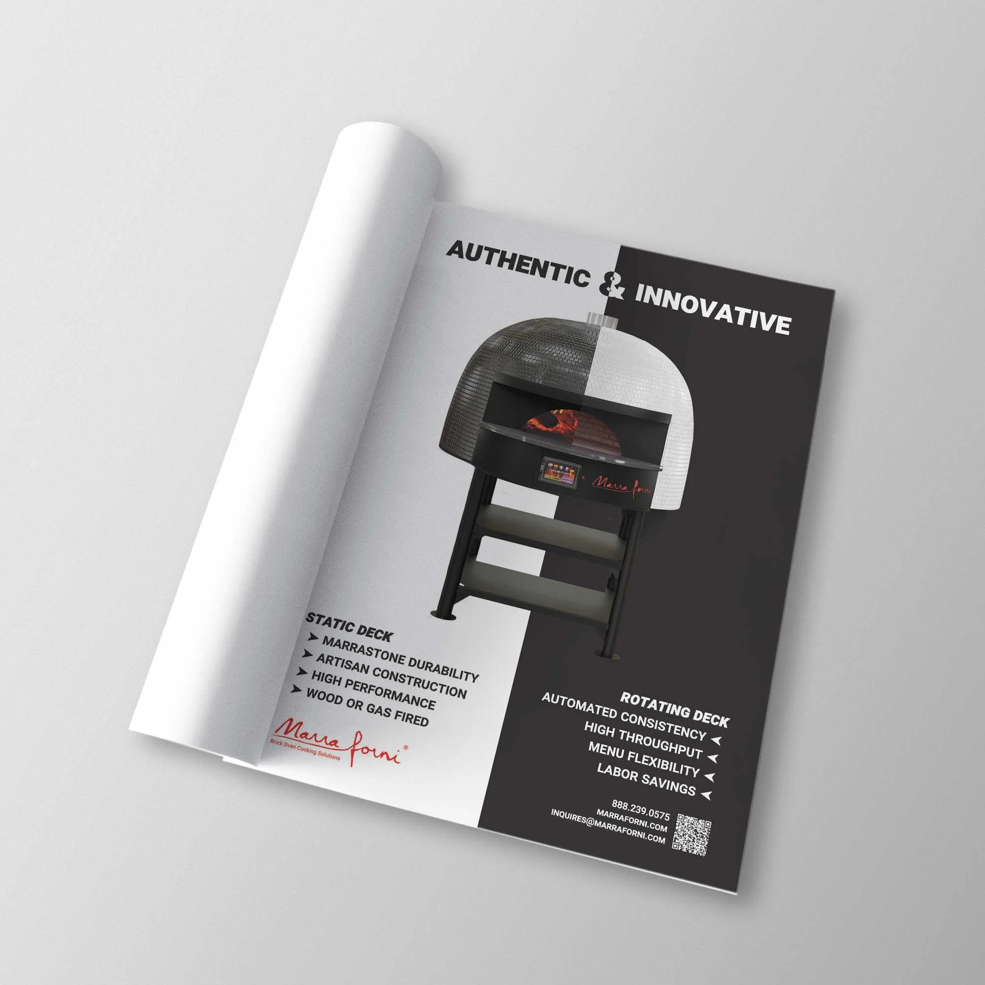
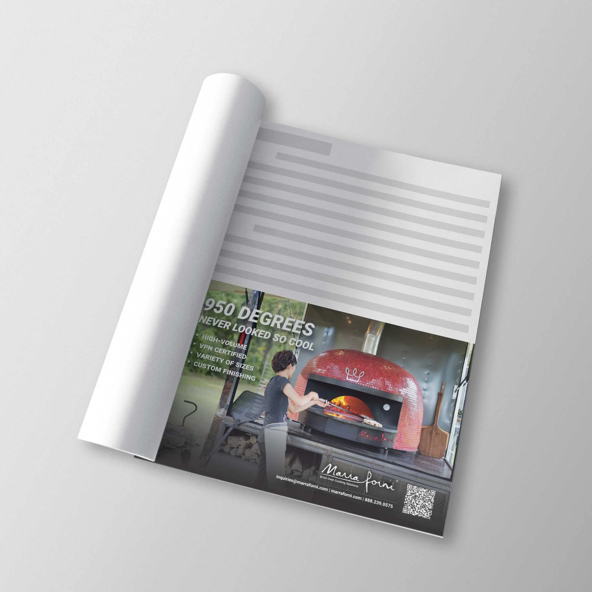
The company had a paid advertisement contract with magazines such as, Food Equipment and Supplies (FE&S). I was to send a high-quality magazine ad in the needed size by a due date every month, highlighting different themes. The company had asked for certain products and key words to be included in these advertisements. Since this would be in a magazine showcasing our other competitors, I had to make sure that the pieces I submitted would stand out from the rest.
THE SOLUTION
I would find pictures that would be suitable for the month’s theme and create graphics to compliment them nicely. After brainstorming with the Marra Forni marketing team, I would finalize on call-to-action text phrasing and other details that would bring the ad to life. Utilizing attractive and/or eye-catching photos and catchy one-liners, I was able to create content that would be able to successfully compete against the hundreds of others in the magazine.

