Oro Pizza
OVERVIEW
Oro Pizza is an onsite catering service that specifically offers a variety of wood-fired pizzas.
The company is another sister company to Marra Forni. Since it was started more recently in comparison to the other companies, it is still relatively small and undergoing development.
Logo Concepts
ROLES
Concept, Design
TOOLS USED
Illustrator
COLLABORATORS
Director of Marketing, Marketing Team
THE CHALLENGE
I was tasked with creating and presenting a few new logo concepts to replace the current Oro Pizza logo. Although Oro Pizza has a logo that is being used, there is room for improvement to help match closer with their brand and identity.
THE SOLUTION
I researched the brand, their audience and their goals. Using the current brand colors as guidelines, I crafted a few new versions of the logo to present. It is still undergoing review and approval, though has been acknowledged by the CEO.

Process & Concept
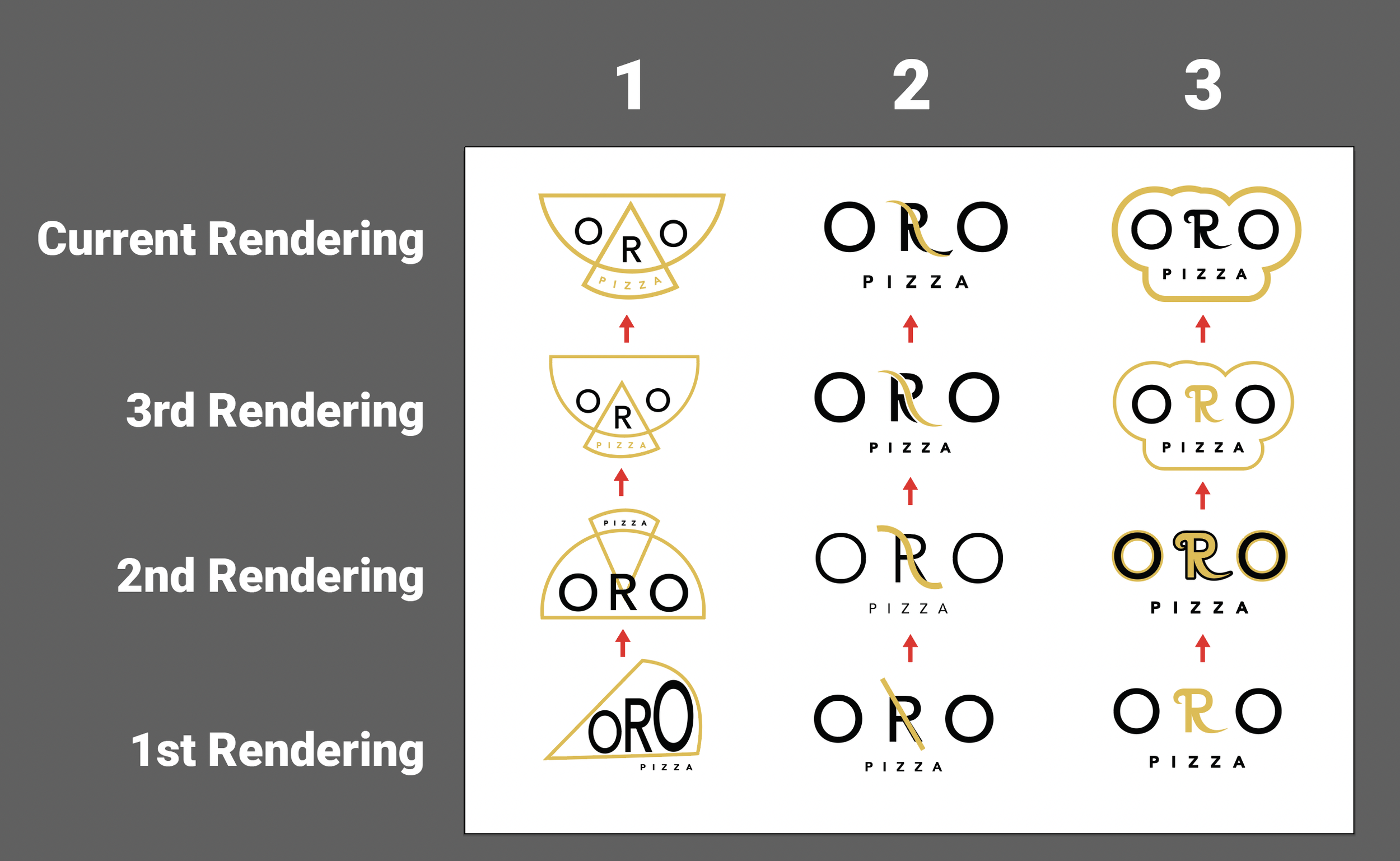
Logo 1: This concept was based off how the company wanted the logo to look like a distinguishable pizza from someone viewing the logo far away. I thought a more modern, clean, and simplistic look would suit the brand so I gradually leaned towards simple shapes, consistent sizing, and even spacing. I liked the concept of a simple pizza shape being pulled out of a larger pizza whole and refined this idea.
Logo 2: Minimalistic logos with clever meanings subtly show depth in a company. I liked how balanced the word “ORO” felt and wanted to see how to incorporate a logo into the middle. My first thought was to show the line that is left behind when a pizza slice cuts pizza. Then I played on the idea of a "S" shaped swirl imitating a cheese pull when a slice of pizza is taken out.
Logo 3: The old logo had cursive elements, so I wanted to branch off of this. The letter "R" had the most potential for decorative elements in a letter, so I kept this letter cursive. This type of logo would give more of a "fun" and "outgoing" mood to the branding.

After deciding on a design to refine, I created different colorways and background the logo would be compatible with. These were made to present to the marketing team for feedback and refinement. This was a test to see the compatibility of the logo when we would use it on print, digital, banners, etc.
Colorways
