Pizza University
OVERVIEW
Pizza University & Culinary Arts Center is a pizza school that teaches its students theoretical and hands-on knowledge of pizza-making.
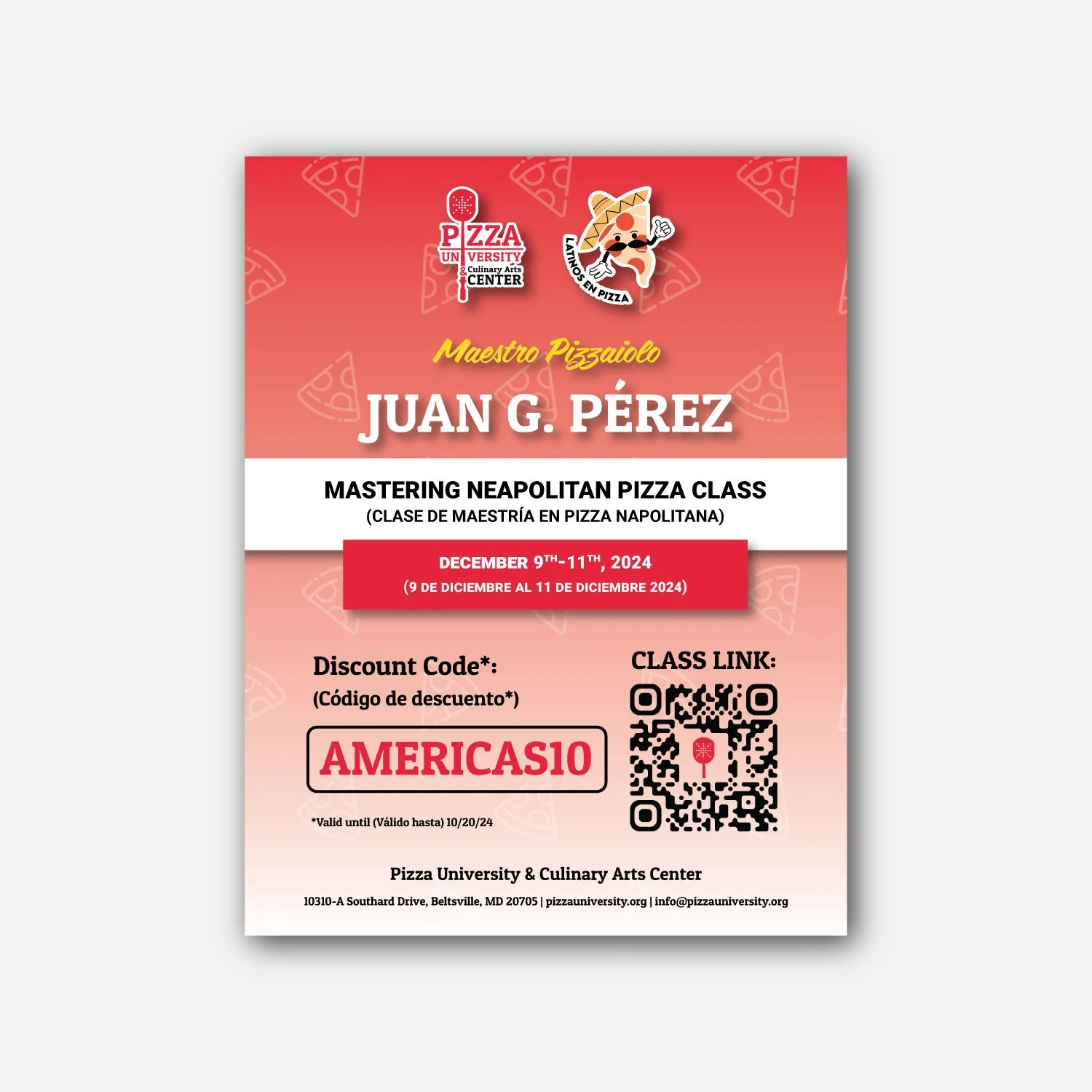
It is Marra Forni’s sister company, and as the in-house graphic designer/marketing specialist for Marra Forni, I was tasked with designing graphic material for Pizza University as well. Unlike Marra Forni, which is mainly B2B, Pizza University sells to consumers. I worked with the marketing team and executives of Pizza University to create and establish consistent branding that would pair well with its vibrant and playful identity.
One Sheets/Flyers
ROLES
Concept, Design, Print
TOOLS USED
Illustrator, Indesign, Photoshop
COLLABORATORS
Program Manager, Director of Marketing
THE CHALLENGE
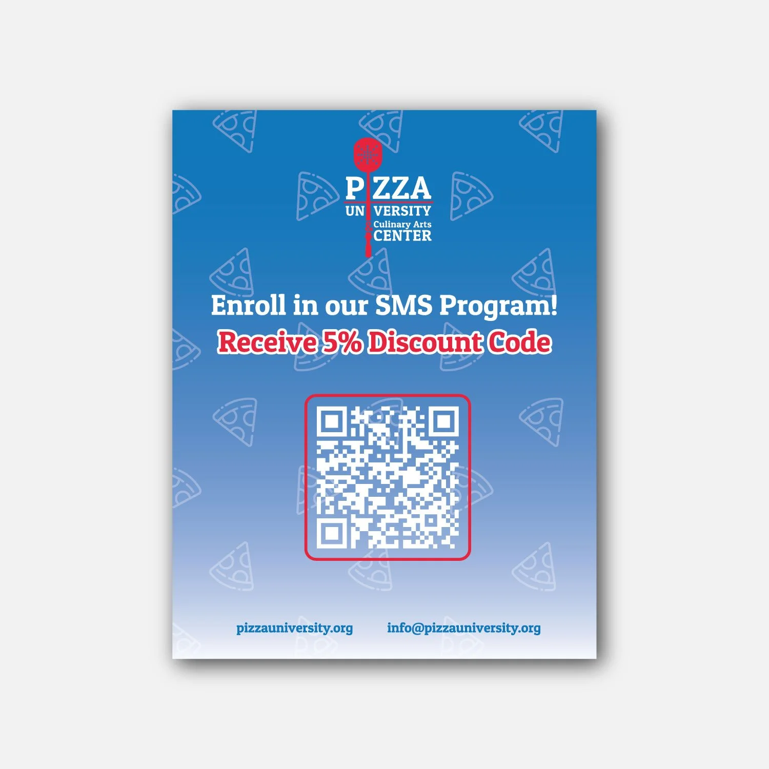
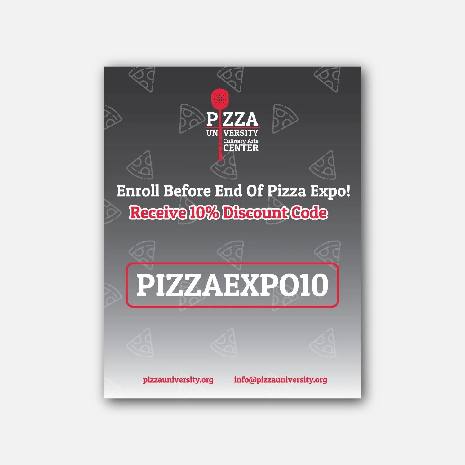
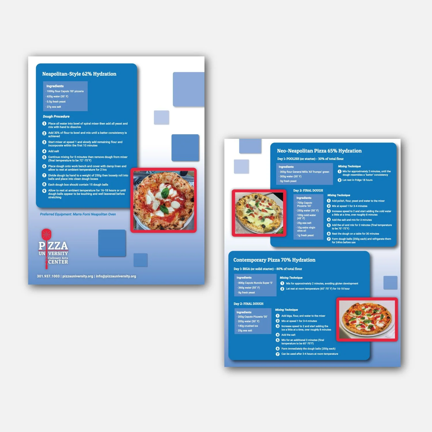
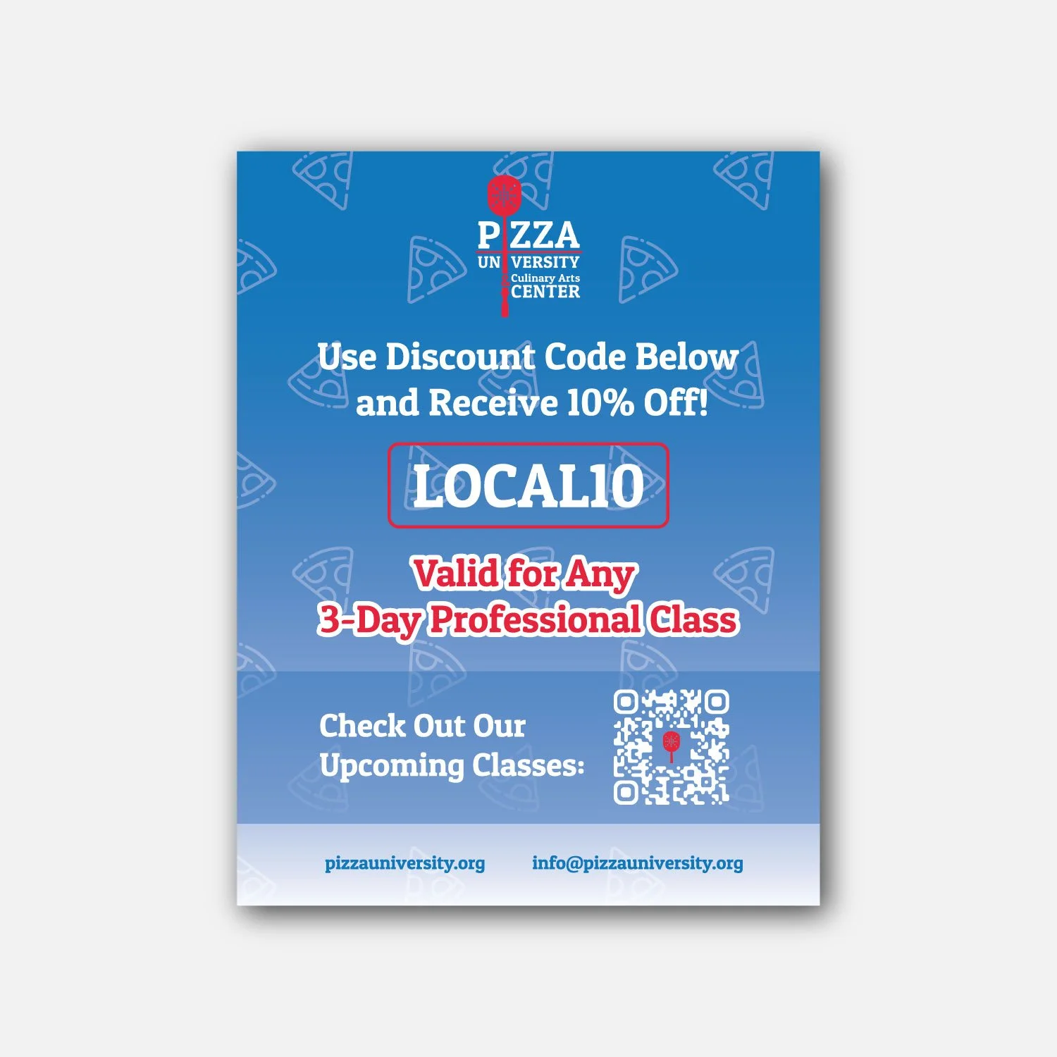
Although Pizza University was a sister company to “Marra Forni”, the company had different branding guidelines that they needed to follow. Flyers that were in need of designs would be directly handed out to potential students in a younger demographic. A company that sold classes to novices in the pizza-making industry had to appear livelier and more casual to appeal to its target audience. These marketing materials would also require consistency for better memorability and impression.
In order to capture the attention of potential students who may still be hesitant about the industry itself due to being more inexperienced, I had designed many flyers that were bright and friendly. The goal was to appear welcoming to ease any feelings of intimidation potential students may feel and encourage them through easy-to-use and readable design. I also made sure keep consistency in branding colors and fonts, and to use similar graphics and style throughout all flyers.
THE SOLUTION
Tradeshow Materials
ROLES
Concept, Design, Production
TOOLS USED
Illustrator, Indesign, Photoshop
COLLABORATORS
Program Manager, Director of Marketing
THE CHALLENGE
The company was in need of effective branding for our participation at tradeshows that would mostly target potential partners/sponsors in the pizza-making industry. They needed to make their identity and goal known, while convincing these potential sponsor companies why it would be beneficial for them to invest in Pizza University. Since the booth is often paired with the Marra Forni booth, it needed to differentiate itself, while also not overpowering the sister company.
I designed tradeshow materials that would be included alongside the Marra Forni booth that would uniquely represent Pizza University. These materials would not only highlight the company’s purpose, but advertise our current partners as a method to convince future ones. While I created a consistent visual theme across all Pizza University materials, I ensured that they had some similarities in layout and style with the sister company. In this way, it would stand out and make itself clear it was a different company with different purposes, yet not put the sister company in its shadow.
THE SOLUTION
Partner’s Packet
Like the Marra Forni booth, I was to create smaller versions of the larger banners to place on the booth tables. This would be used for minor shows, where the team would not be bringing all of the heavy large banners and would need smaller material in replacement.
Since all the elements would have to shrink, I had to leave out certain material. Brainstorming with the marketing team, we agreed not to include the partner logos on these smaller banners, which would be difficult to see at that size, and add a QR code instead. As people will be up-close when seeing these banners, it would be easy and convenient to scan.
Tall Standing Banners
I was tasked with designing double-sided tradeshow banners for the brand. Since only the top part of the banner can be seen from far away, the most important branding elements were prioritized to the top half of the banner. I was asked to make two color versions, but to keep the content the same.
One side would showcase our sponsors/supporters with their logo and tier placement. Due to all large variety in the colors of the sponsor’s logos, I decided to keep that section on a white background. By using this method, the logos would not clash with the background color and make it difficult to see.
The other side was to capture people’s attention and help differentiate from the sister company branding. I was told that they also wanted to see if it could also serve a purpose as a banner people attending tradeshows could take pictures in front of. If these attendees were to post their pictures on social media, it would further help branding recognition and discoverability.
Retractable Tabletop Banners
The company wanted to create a booklet that could be handed out at professional tradeshows, not for the students, but for other companies in the industry who would be willing to sponsor the company. This packet would need to demonstrate why a potential partner would want to support our company and what benefits they would receive in return.
I worked with my marketing director and staff of Pizza University to highlight key positives of the company and highlight the different partner plan tiers with both their costs and benefits.
Banners In-Use at Tradeshows
Additional Materials
ROLES
Concept, Design, Revision, Print
TOOLS USED
Illustrator, Photoshop
COLLABORATORS
Program Manager, Marketing Team
The company needed both digital and print materials for marketing as well as class events. As they would each be for different mediums and sizes, I had to adjust every project specifically for their special needs and requirements. Despite this, they must stay connected and not stray too far from the general brand identity.
THE CHALLENGE
I followed requirements required for each projects and catered my design to the size and medium. For example, materials that would be used in a smaller format would have to be larger and bolder than materials that are much larger in form. It is important while working in a digital space that a designer envisions how the final product will look and determine its readability and functionality. If there were too many elements initially required in a small space (ie. long text) I would suggest ways to cut it down while still keeping the main message and goal of each project.
THE SOLUTION
YouTube Podcast Thumbnails
Pizza University had wanted to create a YouTube podcast series to help grow an online presence and visibility. I created eye-catching thumbnail banners for the videos that would appear in the playlist under our YouTube channel. I ensured that they would be easy to recreate consistently, as to keep the visual identity clear. I chose pictures from the podcast itself to create a thumbnail that would appear friendly and appealing to potential viewers.
Class Print Certificate
I was tasked with re-designing a Pizza University class certificate template that could be easily adjusted for each class and printed accordingly. Although the company had a certificate design they had been using in the past, it did not align well with the current brand guidelines and was not as appealing to students who would be handed one after the completion of a class. Using the brand’s bright colors as accent colors, I designed a certificate that would be both sophisticated and representative of the brand.
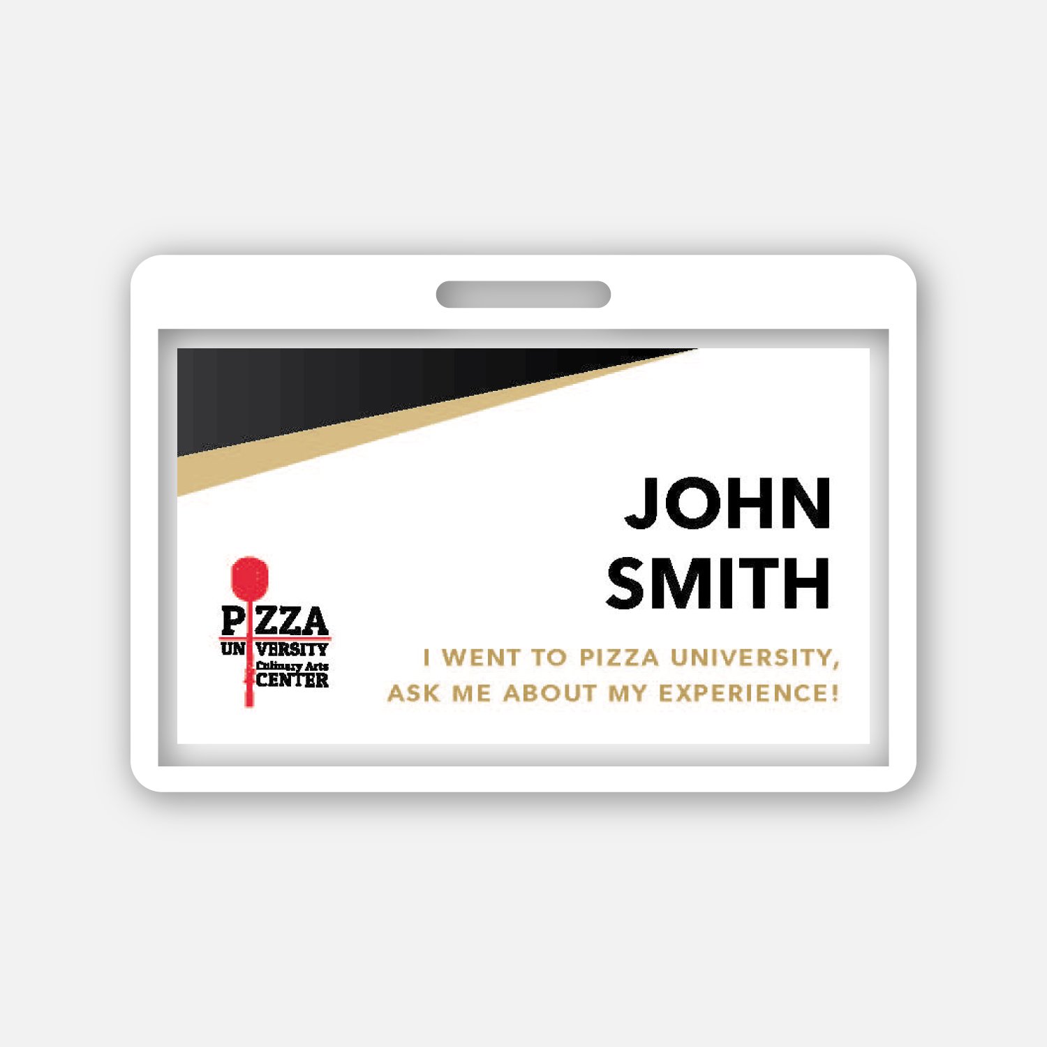
Student Name Tags
The company had held an alumni event, where past students would join with new students and discuss their experiences. I was assigned with creating name tags for the alumni students so it would be easy to identify them. Giving a subtle reference to the class certificates through the design and gold colors, I designed a clear template that would be printed for each of the alumni students attending.


